First Global Packaging Update Since 2016 will Feature Coca-Cola, Coca-Cola Zero Sugar and Diet Coke
The Coca-Cola Company today announced a new design system for the Coca-Cola trademark that brings Coca-Cola, Coca-Cola Zero Sugar and Diet Coke together in an evolution of the ‘One Brand’ Strategy that launched worldwide in 2016. The new design is simplified, removing added elements such as the red disc, to elevate the iconic trademarks with global consistency. As a visual metaphor to uplift, the new design also proudly raises the Coca-Cola logo to the top of the label.
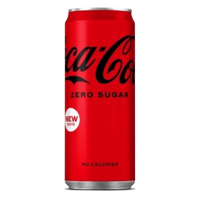
The design begins with the brand’s original and universally-recognised colour red – signalling authentic, delicious and refreshing Coca-Cola taste. When red is paired with white Spencerian script, it is Coca-Cola Original Taste. When paired with black script, it is Zero Sugar, leveraging the trademark and typography is a different way to indicate the Zero Sugar variety coupled with other details such as black bottle caps. Diet Coke will also sit within the Coca-Cola trademark design family, with their signature silver background and red logo.
The updated design will be led by Coca-Cola Zero Sugar, which has also debuted a new recipe with a delicious and refreshing taste that brings it closer to that of the iconic, Coca-Cola Original Taste. A new marketing campaign will support the new recipe for Coca-Cola Zero Sugar. The campaign, “Best Coke Ever?”, invites debate and trial before making any decisions. It’s a simple question that asks a lot: What if the new Coca-Cola Zero Sugar is, for some consumers, the best Coca-Cola ever? The campaign explores this debate across TV and digital films, out-of-home assets and calls on influencers and consumers alike to join the debate in social media.
